Friday, April 29, 2011

Rose, Blue, and Green

This week the Bloggers Challenge is a color challenge. The challenge is to use the colors rose, blue, and green on our work. My card is simple, but I love the texture created by the embossed panel and the design paper and the chipboard letters. I needed a thank you card this week, so this fits the bill perfectly.

Thursday, April 28, 2011

Earth Laughs in Flowers


Even though the temperature isn't screaming spring, at least the flowers are starting to show themselves as I showed on Easter with photos of my magnolia tree. This card is a celebration of spring flowers. I started with a piece of white cardstock. I used weathered wood distress stain for the color and then stamped the background using the Chapel Road Artstamps Floral Background stamp in fuschia. The sentiment stamp, also from Chapel Road Artstamps, is from the stamps set, Small Poems. I used the level up technique from Technique Junkies on the flowers in the sentiment circle for dimension. The circle is layered on a tag from Spellbinders Fancy Tags 3 which is layered over a ribbon. The pearl flourishes were created using the cream colored Viva Pearl Pen.

Sunday, April 24, 2011

Wishing everyone a Happy Easter and a wonderful spring.

Saturday, April 23, 2011

Journey, Tim Holtz Style

This week Simon Says Stamp and Show a Lord Tim of Holtz technique and the Grungy Monday challenge was to use Tim's Texture Fades and Distress technique. These were two challenges right up my alley. I'm actually  finishing this card almost at the last minute. I knew these texture trades were on their way and I wanted to use them on my card, so I waited for delivery. The image panel is actually in two layers. The first is a piece of manila cardstock. This is where you find the technique. I used the old car texture trade and stamped the backwards numbers on the folder with aged mahogany. Yep, they come out correctly when they reprinted on the cardstock off the folder. How cool! I used black soot on the car and stamped the sentiment above the card. Layer 2 is a morph of a Tim technique from the 12 tags. I took a piece of packing acetate and embossed it with the umbrella man embossing folder. The acetate embosses like a charm. I then dropped terra cotta alcohol ink in the indented figure which colored him. I layered the umbrella man over the car and attached the panels together with the tiny attacher. I used  a torn paper frame (Technique Junkies) to frame the image and adhered it to a panel of Tim's license plate paper.

Friday, April 22, 2011

Ribbon and lace and roses, oh my

I'm dedicating this card to my muse who has been kept pretty busy lately. This week Bloggers Challenge is to use ribbon or lace. I'm not the greatest with ribbon and lace, so this was a bit of a challenge at first.  Once I pulled out my Sizzix butterfly die, things started to fall into place. The butterfly was cut from vellum. The cutting wasn't the problem. When I tried to emboss it in an embossing folder, the Vagabond almost welded the vellum to the folder. I solved the problem by sandwiching the vellum between two pieces of cardstock. I ended up with a perfectly embossed butterfly and two pieces of embossed cardstock that I can use later. The background paper is from Graphic45. I'm in love with it. The die cuts behind the butterfly are made with Tim Holtz dies. In the center of the butterfly is a circle of lacy ribbon and my ribbon bow (had to review a video to remember how to use the Bow Easy). The roses top off the lace and bow. On the side is a word stick with the word MUSE.
Happy Friday. Enjoy visiting the blogs of the other players to see their wonderful art.

Thursday, April 21, 2011

Fun Folds

This week is the beginning of another challenge at the Class Act Insider blog. The challenge is to create a non-traditional card using a unique fold or shape. I chose to create a tri-fold shutter card. Trust me, it looks much more complicated than it really is. Starting with a 5 1/2 x 12 inch sheet of paper, it takes four scores and two cuts. You can find detailed directions HERE. The real fun begins when you start to decorate the card. I started with a designer paper from My Mind's Eye to cover each of the sections. All of the stamps used are from the Chapel Road Artstamps division of Class Act Inc. The sentiment on the front is from Small Poems. I used a rhinestone flourish for a little bling. All of the flowers are from Rudbeckia Angle. The butterflies are from Butterfly Square. The sentiment and flowers were all created using the Copics expressions technique from Technique Junkies. Using alcohol and Copics direct to stamp, you can get lovely watercolor-looking images. I like the technique also because you can use different colors on the stamp and only stamp it once. I hope my card sends out a feeling of spring to everyone.

Wednesday, April 20, 2011

Circles of Love

This was a fun card to create using the embellished circles technique from the current issue of Technique Junkies. I decided to use an Asian theme, so I used a piece of Asian paper as the image panel. The images (circles) are from a variety of stamp companies: Stampin' Up, Club Scrap, and Papeterie.
I want to say congratulations to Hels Sheridan (Ink on my Fingers blog, Sunday Stamper challenge) who is celebrating her 150th challenge and 1000th blog this week with a challenge of Love and a give-away of some fantastic blog candy. If you haven't been to Hels' blog, please visit. It's a treat to look at her art and it's a hoot to read. Another challenge I try not to miss is Created by Hand (Quietfire Designs). This week the challenge is Circles. Hmmm. Does this technique qualify, or what?

Monday, April 18, 2011

Bunny's Easter Basket

The Challenge at Creative Belli Blog this week is Eggs/Bunnies. I thought that this stamp with a big bunny with an Easter basket full of chicks and Easter eggs was perfect for the challenge. The stamp is from Cornish Heritage Farms (no longer in business). I used my Creative Inspirations Paints to color the image. I then created the background. I took a light blue piece of cardstock and layered mesh tape over it. (I haven't used this tape in years.) I then sponged CI sky blue paint over the whole piece and then dabbed pink, yellow and white over the blue. The image was cut out and adhered to the background. This was layered on a purple panel and then to a yellow base card. (It seems to have scanned orange-ish). I stamped the sentiment on some pink designer paper and then adhered a fragment tag over the top. I just love the bright spring colors and the fun image.

Saturday, April 16, 2011

Vintage Shoe

This week the challenge at Created by Hand is Dancing Shoes/Vintage. I think my image is heavier toward the vintage and less dancing; however before the flowers were added, I'm sure the shoe was used for dancing. That's my story and I'm sticking to it. This is an image from Bella Rosa. I used my Creative Inspirations Paints to color it and the pulled glimmers technique from Technique Junkies for the background of the image. The sentiment is a Quietfire stamp. The background border is a Heartfelt Creations/Spellbinders die. The music on the back panel is from the Ephemeral Backgrounds stamp sheet from Artistic Outpost. I've had this stamp for a long time, and I finally found the perfect place to use it. I'm smiling.

Friday, April 15, 2011

Postcard Greetings

This weeks Bloggers Challenge is a sketch which our list Mom Lisa provided. It's a great sketch which I can see using over and over.
Bear with me since this sketch inspired a card which fit several challenges this week/month.
The card focal image is from Home, a stamp sheet from Artistic Outpost stamps. I colorized it using the distressedcolorblocking technique from the Feb/Mar 2011 newsletter. The panel behind and to the left is done using the dry embossed wash technique (Dec.2007 TJ newsletter, and this weeks Try That Technique challenge). All of the background layers are done in shades of BLUE which is the challenge at Ink on my Fingers--Sunday Challenge. Speaking of layers, There are 7 layers on this card. At Artistic Stamper the monthly challenge is LAYERS. And finally, Simon Says Stamp and Show Some Distressing. Let's see -- distress inks on the focal image, gesso distressing on the under panel, torn muslin for the bottom ribbon layer, and distressed edges on the image panel.
I can't wait to see how the other blog players interpret this sketch.

Thursday, April 14, 2011

Song of Spring

It's getting to be more springlike here in Chicago. I'm ready to sing, dance, and take joy! as the card says. Today I used flowers from the DaVinci Botanicals stamp set from Class Act Inc, Chapel Road Artstamps. The sentiment is also a Chapel Road stamp from the Small Poems set. I stamped the floral stamp with Versamark on white cardstock and brushed over them using the blue from the Perfect Pearls naturals. Then I painted the flowers and leaves using Creative Inspirations paints in sage, tickled pink, and peach. I used a Spellbinders label die to cut out the flowers and traced around it for the narrow layering panel. The ornate gold window is also a Spellbinders die exclusive to Heartfelt Creations. The background card base is dry embossed using a Sizzix (Tim Holtz) texture fade and then highlighted with tattered rose distress ink. To finish the card I added rhinestones to the ornate die and sentiment.
Because of all of the rhinestone bling and the sparkle from the Creative Inspirations paints, this card also fits the requirements of the Tuesday Throwdown challenge.
Let's sing, dance, and welcome spring.

Monday, April 11, 2011

Seamstress with Colorwash

This is week 3 of Grungy Monday challenges. I am also trying my hand at a Creative Belli challenge. They work perfectly together this week. The Grungy Monday challenge is to use Ranger Adirondack Color Wash on our work. Since color wash works so well on fabric I decided to use fabric on my card. The Creative Belli challenge was to think seamstress and use sewing on our work. See what I mean...fabric and sewing work hand-in-hand.
 I began my card by taking a piece of muslin large enough to cover my background panel. I sprayed it with  denim, butterscotch, and stream. The dress form is also covered with muslin. Note the seam binding ribbon scarf around the neck area. I used the Needle Book stamp from Haberdashery and the die cuts from sewing room. As for unused embellishments, the silver, gold and yellow threads have been waiting for use since my daughters were young. (They're both grown now.) I wrapped the silver and gold thread around the spools and tried my hand at sewing along the side of the card with the yellow. The flower is made from a strip of muslin which I wrapped and folded around a circle base covered with adhesive. (Tim Holtz made tissue tape flowers using a similar method.) I sprayed the flower with butterscotch color wash and attached the button die which I colored with fire brick distress stain.
Although sewing is not my thing, when it's combined with Tim Holtz products, even I can enjoy it.

Sunday, April 10, 2011

Grungy Monday Two

This week the Grungy Monday Challenge takes us to RangerInk.com. The challenge uses distress ink with Studio Multi Medium. You can view the technique HERE. Also, please visit Tim Holtz's site for inspiration. I decided to go a little Steampunk with my art tag this week. I used Tim Holtz's gears die cuts for my stamps and the bird for the focal image. I did have to make a slight adjustment to the technique since I don't have my multi medium yet. It's on order. I used another Ranger product, well actually ex product since they don't make Matte Accents any more. The matte accents was a favorite of mine, so luckily I have some in stock. Anyway, it worked fine for the technique. The distress inks used were rusty hinge, shabby shutters, and weathered wood. Walnut stain was used to distress the edges. The bird was covered with glassine paper and embossed in a texture fade. I used broken china distress stain over the embossing. The bird's wind-up key and the metal wing was rusted using copper alcohol ink. I edged the tag with tissue tape. and added a few gears to embellish. The ticket and sentiment are from the Odds and Ends stamp set. Isn't Grungy Monday fun!

The Altered Alice CHAPTER 3 - Alice Colors of Blue and Yellow - Week 2

This is a fairly long blog post today. I hope you will find it interesting and that you enjoy my artwork below.

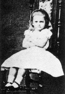
"Mr. Tenniel is the only artist, who has drawn for me, who has resolutely refused to use a model, and declared he no more needed one than I should need a multiplication table to work a mathematical problem! I venture to think that he was mistaken and that for want of a model, he drew several pictures of "Alice" entirely out of proportion - head decidedly too large and feet decidedly too small."

-- From a letter by Lewis Carroll (pseudonym of Charles Lutwidge Dodgson)

Although the stories were written for and inspired by the brunette Alice Liddell, when it came time for Tenniel to create the illustrations, Carroll sent him a photo of blonde Mary Hilton-Badcock as his image of what Alice should look like. Early color illustrations of Alice show a girl with long blonde hair, wearing either a blue dress with a white pinafore, or a yellow dress with a blue and white pinafore.


Therefore, our challenge this month is to create something that is predominantly blue and yellow, the colors associated with Alice! Although it is not required that you use Wonderland in your project, those that do feature Wonderland will receive two chances at the drawing instead of one! Enter by Friday, April 22 at 8 p.m. Eastern Daylight Time (GMT -4:00) and the winner will be posted sometime on Sunday, April 24.
Our April sponsor is Aritistic Outpost, makers of fabulous rubber art stamp sets including the Wonderland Collage set that will be featured by our design team. The Artistic Outpost design team will be playing along as well! One lucky winner will receive a $14 gift certificate to the Artistic Outpost store.


This month I am sharing an art form I was recently introduced to. I created my first ATB or Artist Trading Block, (also known as wooden atc or chunky atc). You start with a wood block 2 1/2 by 3 1/2 inches and 1 1/2 inches deep. The rest is up to the artist. Using my stamps from Artistic Outpost's Wonderland Collage, I created my atb. The challenge colors are blue and yellow, so I tried to utilize the colors on all sides of the block. The block itself was colored using weathered wood distress stain which has a bluish cast to it. A yellow ribbon encircles the block. Below are more views of the piece.

On one side Alice is helping the white queen with her hair. The image was stamped and then cut with a Spellbinder's die cut label. Behind the label I put a little angelina fiber for added texture. I added one of Tim Holt's Idea-ology hangers for a little fun.
On the reverse I used part of the Alice image and put a faceted fragment over it. I hung one of the metal tassels from the fragment. The sentiment says "If the crown fits..."
The two sides are layered with Graphics45 paper. On side features the white rabbit over a tag which says "I'm late" The other side features the dodo bird and the sentiment "Curiouser and curiouser". the top of the block is covered with small yellow and blue flowers and one larger flower with a clock as its center.
Check the Altered Alice blog to see other fabulous pieces of art for this challenge.
I am also entering this atb in the Simon Says Stamp and Show anything but a card challenge.

Friday, April 8, 2011

Spring Inspiration

This week the Bloggers Challenge was to use a photo as the inspiration for our card. This was the inspiration photo we were given.
Here was what the image inspired to me: black and white with a splash of green; pastels background; and flowers and leaves of spring.

I tried to incorporate those thoughts into my card. I started with the Large Floral Background stamp from Chapel Road Artstamps. I stamped it with black archival ink on cryogen paper. I then took another piece of white cardstock and swiped pan pastels over it in pastel colors. Using a Spellbinders label die, I cut a window into the pastels panel and layered it over the flowers. The sentiment "Every leaf a miracle by Whitman" was stamped using markers. I colored the leaves with green and the words with black. I huffed to remoisten and stamped on white cardstock. The sentiment is from the stamp set Four Small Poems, also from Chapel Road Artstamps. I edged the pastel window layer and the sentiment layer with pumice stone distress ink and added a little bling. On the centers of the flowers I used rock candy distress stickles. On the corners of the card I added small rhinestone flourishes.

This card also meets the challenge at Created by Hand which is spring fever/pastels.

Thursday, April 7, 2011

Triptych

Closed
Open
The current Stampotique Designers Challenge is to design a triptych using Stampotique stamps. At Critter Sketch blog the challenge is to create a card using fancy folds.

I started this card with a triptych shaped cardstock. The inside was covered with designer paper and the outside was stained using faded jeans distress stain. The front was stamped with the hexagon and the small bee stamps. The bird was stamped and cut out. The sentiment was stamped on a square and adhered to a panel which matched the inside. Half of the sentiment panel was adhered to the left section.  The bird was adhered to the right section as if he is standing on the sentiment. A round clip holds the card closed.

The inside was fun. Bob (in time out) sits quietly under the shrooms with his cat and rabbit. A bird and bee also keep him company. This is Bob's own quiet place.

Tuesday, April 5, 2011

Spring

This week the Try That Technique Challenge was Watercolor over White from the 2006 TJ CD. I did morph the technique slightly. Instead of watercolor crayons or pencils, I used my Creative Inspirations Paints. They are a watercolor paint, but they have a shimmer to them. I really like how they look on my butterflies. The background stamp is from Chapel Road Artstamps. The challenge this week at Tuesday Throwdown is spring. I do love spring.

Friday, April 1, 2011

Bloggers Challenge Birds

This week the Bloggers Challenge is Birds. I love bird stamps, so the hardest part of the challenge was to narrow down which stamps I wanted to use. I chose this large stamp from Stamp Camp. I started with a pulled glimmers background from Technique Junkies. The stamp was stamped over the background. I used Copics to add color highlights to the image. When looking for the appropriate sentiment, the word Paradise seemed perfect. The abalone shell colored pearls added the finishing touch.