Sunday, November 27, 2011

Candy Jar

This week our challenge at Grungy Monday was to create something in the style of Tim's Piece for the Ranger Ink Great Pumpkin Challenge. We didn't have to decorate a pumpkin, but this jar I had for holding snacks in my studio just cried out for some sort of decorating. For the jar I used the metal tape, an alphabet embossing folder and stream and lettuce alcohol ink. The cover is plastic, so I used alcohol ink directly on it and added the doily, metallic doily, and metal flower. I didn't have to color the flower and leaves since I had metal in the right colors. I added a bow as a finishing touch. Here are a couple of other views of my jar.


Saturday, November 26, 2011

Tickets to the Circus

Now that the flurry of Thanksgiving cooking and entertaining is over, I was able to get back into my studio for a little while today.  Today's card covers several challenges.
This week's sketch challenge at Mojo Monday worked so well with the challenge Simon Says Stamp and Show tickets. In Chicago it's time for the circus. Right after Thanksgiving Ringling Brothers comes to town. So it's appropriate that I use a circus motif for my ticket card. All of the stamped images (full and partial) and word (partial) are from the Artistic Outpost stamp sheets Vintage Circus and Send in the Clowns.
The challenge at Three Muses is That's Entertainment. I don't know about you, but I think that the circus is great entertainment.

Don't forget...From now through November 30th, you'll get rewarded when you shop at Artistic Outpost! For every $25 you spend, Artistic Outpost will send you a special gift code for $5 (GC must be used by March of 2012).  Better yet!  These gift codes stack! If you spend $50 you will get a $10 certificate, spend $100 get a $20 certificate!  Remember, in the US you get free shipping when your order totals $50 ($250 internationally).

Friday, November 25, 2011

Color My World

It may be Black Friday today, but Bloggers Challenge is one of color. We are challenged to use our favorite colors. I love trying all kinds of color combinations and my favorites often depend on my mood or the season. However, I do know that I tend to lean towards the color teal and love it combined with green. Once that was decided, I needed a great image. Since I spent the last two days preparing for and celebrating Thanksgiving, I got a little behind. I knew I had to do something somewhat quick. This beautiful stamp from Artistic Outpost Sleigh Ride was the answer. The green background paper was just waiting for a great stamp, so I was set. The paper has a texture like canvas, so it was a little tricky to stamp on. I used Versamark to stamp and the beautiful Carnival embossing powder from PK Glitz. The sentiment is from Club Scrap. To finish off the image panel I used Viva Decor Iced White to create snow on the tree. By the way I learned that you can help dry Viva Decor paint with a heat tool. I was careful, but it worked. I could scan my card without leaving paint spots on the scanner.
Hope you enjoy looking at what the others have done. We'd love to have you join us. Just link your entry below.

Wednesday, November 23, 2011

Sale at Artistic Outpost

It's time for a sale at Artistic Outpost.

For every $25 you spend, we'll send you a special gift code for $5 (GC must be used by March of 2012).  
Better yet!  These gift codes stack! If you spend $50 you will get a $10 certificate, spend $100 get a $15 certificate!  Remember, in the US you get free shipping when your order totals $50 ($250 internationally).
This sale is good through November 30.

**Gift Codes will be emailed to you in December.
***Please note if you order more than 6 sheets of EZMount cling foam, free shipping will not apply. These items are bulkier and require extra shipping costs.

Tuesday, November 22, 2011

Harvest

This month it's all about the farm at Gingersnap Creations. The chestnut theme challenge is farm fresh. At this time of year, the apples are fresh and scrumptious. It's fun to go to the farm and pick your own basket of apples. That's what my card represents. The hay is baled and the apples are picked.
I used the stacked nesties technique from the current TJ newsletter for my card design. the image stamps and sentiment are from Kitchen Sink Stamps "Harvest". The background panel is wood paper. I thought it would give a rustic look to the card.

Color recipes: (All inks are Adirondack unless noted.)
Apples -- 1 salmon, 1 watermelon, 3 Lady Bug (Memento), 4 Crimson
Basket -- 1 sandal, 2 caramel, 3 ginger, 4 espresso
Hay -- 1 sandal, 2 butterscotch, 3 ginger

Monday, November 21, 2011

Designer Paper

Sharon's challenge at Rogue Redhead Designs is to use only one piece of designer paper on our cards. I used a piece from My Mind's Eye, Lost & Found Two and the focal panel on my card. The sentiment is from RRD Floriculture. I stamped and embossed it directly on the DP. On the right I stamped the flowers (also from Floriculture). I first stamped off and then stamped them directly on the DP. I think the flowers and sentiment look beautiful stamped directly on the panel.

White Christmas

Paper piercing, Frosty the Snowman, and White Christmas are the themes which led to my card.
At Creative Belli blog we were challenged to do some paper piercing. One of the underlying challenges at Creative Belli is for us to use our old and forgotton embellishments. Well, my whole paper piercing comes from a time gone by. I have templates and piercing tools from way back when. Once I dusted them off I had a lot of fun. Behind the snowman is a vellum panel. I used a frame template to pierce my paper.
The Fashionable Stamping challenge is white Christmas. Other than a few black items, everything on my card is done in white. The snowman was colored with white and black Pan Pastels. Noel was cut using a beautiful white on white paper. (hard to see on the scan, but pretty IRL)
Hels' Sunday Challenge at Ink on my Fingers had the challenge of snowmen. I used the Tim Holtz snowman die and grungepaper to cut out the snowman. He was colored using Pan Pastels and embellished with a few little buttons, a bow tie (from a recent holiday), and a little bit of well placed marker ink.
The base card is made from some white with black Club Scrap paper.

Thanksgiving Greetings

I had to create a card using this adorable vintage chef. I stamped her on white cardstock and then used the vintage art technique from the Jun/Jul 2011 Technique Junkies newsletter to create the vintage coloring. The background is collaged Circles from the Aug/Sep 2011 newsletter. The lace and the flourish and pearls help to add to the vintage feeling.
The Tuesday Throwdown challenge this week is lots of circles. Since the entire background of this card is made up of circles punched from different design paper, I am entering it in the challenge.

Saturday, November 19, 2011

Birthday Sweets

When I saw that the challenge at Kraft Journal was sweets and baker's twine, I thought I was in trouble. I'm not a cutesie-type person and I didn't think that I had any stamps that I could use. Then I remembered this somewhat grunge cupcake from Club Scrap. I also don't have any baker's twine. But I had planned ahead for that. Of course, I couldn't decide what color would be the best baker's twine to own...there are too many colors. So I made my own. I bought some thicker ply crochet thread, cut a piece long enough for my project, wrapped it around an old medicine container, and with my Copic pen, colored in  the stripes. Once I had my baker's twine, I used it to make a Spirelli die cut panel for behind the cupcake. A cuttlebug highlights panel supplies the birthday greeting. Of course, the card base is Kraft cardstock.

Moonstruck

This week the challenge at Take a Word is Moonstruck. When I saw the challenge I immediately thought of my Moonbather stamp from Stampington. I inked her in cobalt blue archival ink and then stamped a slightly misted reflections music stamp over the inked stamp. This is the result. Because the emphasis is on the moon I stamped and cut out the moon in yellow and adhered it to the image.

Friday, November 18, 2011

For the Boys

 This week the theme for the Bloggers Challenge is "For the Boys". My card is intended for a big boy. It's a train collage stamp from Club Scrap. I stamped the image in smoke grey Versafine ink. Then I tore around the image and added stormy sky distress ink around the edges. The sentiment is an outline sticker. I punched the corners of the navy background panel and added three screw brads at the bottom. The base card is a dark grey.
Welcome to another week of Bloggers Challenge. Enjoy the submissions of the other players. If you want to play along, just add your link below.

Thursday, November 17, 2011

Thanksgiving

The challenge at Outlines Rubber Stamps this week is Thanksgiving. Since the challenge requires Outlines stamps, I had to be a little creative this week. I don't have any Thanksgiving stamps from Outlines. So I die cut my Tim Holtz pumpkin and used my new Outlines background flower stamp (Tiptoe) to decorate it. I added the sentiment onto a tag. The background panel is dry embossed with leaves and berries. Everything is adhered to the card base which is from Tim Holtz's Shabby Chic paper stack. I think the result is very festive and worthy to be included among the Thanksgiving decor.

Silent night

When Hels (Ink on My Fingers Sunday Challenge) talked about the Trail of the Lonesome Pine as the header in her challenge post, this tree die from Tim Holtz immediately came to mind. The challenge is actually  pine colors and/or pine trees/branches.
To create my card I cut my pine tree from olive cardstock (same as the base card. On a white panel I masked the bottom with a torn paper and stamped the stars background (Stampland) with Versamark and embossed with black embossing powder. Over the white bottom I used Rock Candy distress stickles to give the appearance of glittery snow. The words are from Authentique Paper. The tree was adhered and a rhinestone star was added at the top.

Wednesday, November 16, 2011

French Flight Takes Off at Artistic Outpost

French Flight is the newest addition to Artistic Outpost's catalogue of unique vintage inspired stamp collections.

In the late 1700's , two French brothers, Joseph and Etienne Montgolfier launched the first manned ballon from the from the center of Paris and flew for a period of 20 minutes. In 1793, Jean Pierre Blanchard became the first to fly a hot air balloon in North America, yet another French adventurer!

This stamp collection pay homage to these adventurers. Fun, quirky, with a little bit of steampunk thrown in for good measure, French Flight is pure creative delight.

Collection available in both unmounted rubber sheets or pre-mounted on EZMount cling foam and hand trimmed on a clear cling storage card!

For my card I used the mono-masking technique (TJ Feb/Mar 2009). First I stamped the "l'homme aile" stamp in the center and masked it. In two of the opposite corners I stamped the script stamp several times. In the other two opposite corners I stamped the air machines. This is such a fun set of stamps.
For more inspiration check out the wonderful artwork of the other design team members.

Tuesday, November 15, 2011

Ophelia

I used the challenge sketch at Mojo Monday for the basic design of my card. This week Simon Says Stamp and Show some women. Ophelia, from Stampsmith, is the woman I chose to use, and the whole card is rather feminine. Created by Hand wants to see leaves/die cuts. Stampsmith wants a card with ribbon and lace. The background is a lace diecut from Spellbinders/Heartfelt Creations and the flower is made with ribbon.
It's funny how the color pink scans. All of the colors (except the leaves) are pinks and mauves. The lace scanned purple, but it really is a deep pink.

Christmas Tim Holtz Style

This week's Grungy Monday challenge is  Tim's 12 Tags of Christmas, 2007, Day 6. I went with creating a card instead of a tag. I'm going to be needing Christmas cards if I don't get started. First I will say that the card look much better in person. Because of the pinecone I had to use my camera which is not my strong point and the card is very shimmery and would not photograph well.
Anyway, I made my distress mist with bundled sage and a tad of broken china.  I could have used the perfect pearl mists, but I wanted a richer color so I used the distress reinkers. Instead of a tag I used the Christmas ornament die cut. I made my own masks by cutting out the evergreen bough with the pinecone/evergreen die twice. I added the pinecone as embellishment on the ornament. The background, a shimmery vellum, was embossed with the Christmas words texture fade.

Monday, November 14, 2011

A Study in Browns

The current Stampotique Designers Challenge is a sketch challenge which was
designed by Lisa Somerville. I love sketch challenges and they can usually be combined with other challenges. The challenge at Critter Sketch is monochrome. With this card I combined the sketch with the shades of brown. My stamp is from Stampotique. I used the out of the nestie (Spellbinders) technique from Technique Junkies for the image circle. The background square panel is also a Spellbinders die cut. The middle panel was cut from a piece of Club Scrap design paper. The leaf ribbon was cut using a punch. The background panel is also Club Scrap. I really love the look of monochrome, but it can be a challenge to stick to shades of only one color.

Thankful

First I have to say thanks to my friend Lisa for reminding me about my favorite turkey stamp. He is from Kitchen Sink Stamps. I love him for his wonderful detail and realism. For this card I did give him a was of tan Creative Inspiration Paints for shimmer. I cut him out with a Spellbinders die label and layered on the larger label diecut. The sentiment is also from KSS. At the top is a Cheery Lynn banner diecut cut from vellum and painted with mango CI Paints. I embellished my card with a raffia bow and two German scrap leaves. The Spicy Supply challenge at Gingersnap Creations is raffia.

Sunday, November 13, 2011

Thanks

I really enjoyed making this card. It matches three challenges. Kraft Journal challenged us to create a Thank You card.
The challenge at Mojo Monday was this sketch. Simon Says Stamp and Show some up-cycling/recycling. The first two challenges are obvious when you look at the card. My up-cycling/recycling may not be. My flower is actually doubly recycled. A few months ago I did an altered book page and cut out part of the pages to make a shadow box. The flowers are made from these cut pieces. The doily is cut from packing foam. I wasn't sure how it would cut, but as you see, it worked well.

Grungy Monday Tag

This week the challenge for Grungy Monday is to create something in the style of Tim's 12 Tags of Christmas, 2009, Day 7. All stamps are from the Tim Holtz collection. The rabbit, flourish, and grasses are from Spring, Spring, the numbers are from Urban Chic, and the background (paint stamped) is from Papillon.Distress inks used are tumbled glass, stormy sky, victorian velvet, iced spruce, and seedless preserves. I am always amazed at how the different distress inks work so well together.

CHAPTER 9: Autumn Colors in Wonderland Week 2

"`Off with her head!' the Queen shouted at the top of her voice.
Nobody moved. `Who cares for you?' said Alice, (she had grown to her full size by this time.) `You're nothing but a pack of cards!'
At this the whole pack rose up into the air, and came flying down upon her: she gave a little scream, half of fright and half of anger, and tried to beat them off, and found herself lying on the bank, with her head in the lap of her sister, who was gently brushing away some dead leaves that had fluttered down from the trees upon her face."
-- Chapter 12, Alice's Adventures in Wonderland

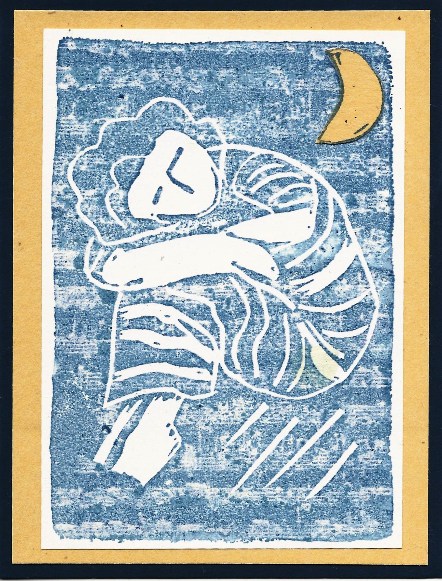
I wonder if the Wonderland story took place in the Fall of the year? Autumn has arrived in the northern hemisphere.  Just as Alice recognized the court characters as playing cards, the trees are losing their cloak of green chlorophyll and showing their true colors of gold, burgundy, scarlet, chartreuse and orange are emerging. Your challenge is to show us a project drenched in fall colors!
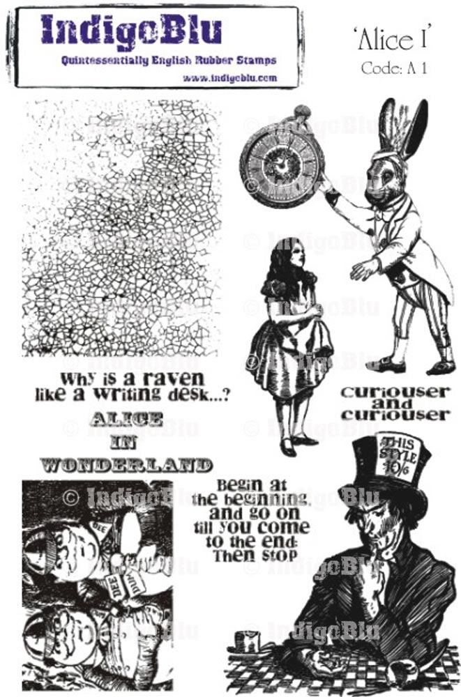
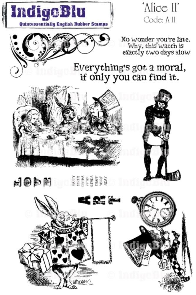
Our prize this month is an A5 sized unmounted stamp set from IndigoBlu (a £13 value), or an equivalent amount of A6 stamps. IndigoBlu is a fantastic new British stamp company that makes "Quintessentially English Rubber Stamps" right there in England.
The design team will be working with these two fantastic Alice stamp sets, titled appropriately "Alice I" and "Alice II". Most Americans don't know what A5 and A6 mean so I'll just tell you, these sets are really big!
 
I encourage you to go visit IndigoBlu.com. All stamps are on sale right now with their introductory pricing, but that won't last forever, and the designs are all wonderful! In addition to the introductory discount, the Head Honcho Alfie says
"The Altered Alice readers can take an extra 10% OFF during the challenge; just use coupon code AlteredAlice in the voucher code box at checkout!"
Thanks Alfie!
Enter by Friday, November 25 (the day after Thanksgiving); our randomly drawn winner and the honorable mentions will be announced on the last Sunday, November 27. Multiple entries are encouraged, but each must be on a separate post. As always, entries that feature Wonderland in some way will get two chances in the drawing instead of one.
Here's my project for this challenge.


For this month's challenge I created three vintage postcards. The first is a collage of many of the images from the IndigoBlue stamp sheets. It's highlighted with shades of yellow, brown, and rust distress inks. Oops, there seems to be cup rings and spots over the card is tea color. Do you suppose that the Mad Hatter decided to move down while reading this card and had a little spill?
The second card features the two different images of the Mad Hatter. I just love the image of the pensive Hatter. Here the colors include greens, red, rust, brown, and just a tinge of blue like the trees against the sky in autumn.
On the third postcard I stamped the tea party image in distress ink and covered it  Perfect Pearls. When I spritzed it with water, the effect is a kind of muted watercolor. It's quite shimmery. (The technique is Tim Holtz's Perfect Distress) Here the colors are the darker colors of burgundy with a mix of gold andbrown.
And to verify that these are postcards, here are the reverse sides.
Have a great month. Hope you join us in this challenge.


Friday, November 11, 2011

Veteran's Day Thanks

Since today is Veteran's Day and since our theme for Bloggers Challenge is Veteran's Day I thought that I would post a patriotic thank you card. I used my flag background stamp from Our Daily Bread Designs. I love this stamp because it makes a great background and it's such an artsy flag. For this card I tried something new. Instead of coloring the flag sections with markers and stamping, I used gelatos direct to stamp and stamped on watercolor paper.  The effect is different, but the jury is still out on this one. I'll have to try some more.
To everyone, Happy Veteran's Day. And to the Veterans, thank you for your service. You are heroes!

Thursday, November 10, 2011

Here comes the Sun

My grandson came to me all excited today because he had seen snow. Well, I didn't see it so I don't have to accept that we had snow...right! Here is my antidote to snow -- a bright happy sun surrounded by bright warm colors.
Actually, I had been seeing several cards done by TJers using the stacked nestie technique from the current newsletter. I loved the look of the technique and had to try it for myself. My image is a stamp from Stampendous; it's an oldie, but a goodie. I stamped the sun on yellow paper with Versamark and embossed it with gold embossing powder. The second nestie layer was cut from a piece of Webster's Pages paper. The third was cut from goldenrod cardstock. These layers were adhered to a piece of glitter paper and then to the base cardstock. I added some topaz colored rhinestone flourishes for bling.

Sunday, November 6, 2011

Skeleton in the Closet

Do you have a skeleton in your closet? Well, I do and here he is. In the RangerInkLink Yahoo group we had a challenge entitles skeletons in the closet. I decided to take the challenge literally and put my skeleton (Tim Holtz stamp) inside the closet. Even the hangers (also Tim Holtz) are there. At Stampendous Impressions the November challenge is chipboard. The closet with door was made using chipboard and then painted. Hopefully, this is the only skeleton I'll find in my closets.

Black and Grey

This card was created for the challenge at Gingersnap Creations (black and grays) and at Outlines Rubber Stamps (friendly fliers).  I started with this beautiful tulip stamp from Outlines Rubber Stamps. I stamped it on gray cardstock and Painted the flowers first with bleach and then over painted with winter frost Creative Inspirations Paints. The dragonflies are black outline stickers. The sentiment is also an outline sticker. I know that the challenge at Gingersnap Creations was announced during October, Poe month. My card isn't macabre; it was created in November and I guess I mellowed. Hopefully, Poe liked tulips and dragonflies.

Saturday, November 5, 2011

Tribute to my Grandma

Again several challenges worked well together and this card was created. To begin with, the challenge for Grungy Monday is to use your favorite Tim Holtz products to create a loving tribute to a friend, relative or inspiring person who's passed away. 
 My grandmother was a very special person in my life. She and I had a very special relationship.There were almost 50 years difference in our ages, but age is really only a number. I always say that she was a woman who was way ahead of her time. This card is in tribute to my Grandmother. By coincidence, the challenge at Created by Hand is grandmothers/label dies.
The design of the card is based on the sketch challenge from Mojo Monday. I did rotate the sketch 90 degrees. The background is done using Tim's wrinkle free distress technique. The lower panel is embossed using one of Tim's texture fades. The flower was die cut using one of Tim's dies. The flower center is made using the I-Top Brad Maker. This is actually related to Tim since it was through his 12 Tags of Christmas that I was introduce to the I-Top (and of course, had to have one).
The doily panel was cut from vellum using a Cheery Lynn die. The frame for Grandma's picture was cut using a Spellbinders die. I used my Print Shop program to change the photo to a sepia photo in keeping with the vintage look I was going for. The Three Muses challenge is vintage collage/memories.
Finally, the challenge at Inspiration Emporium is favorite tools. The I-Top Brad Maker is one of the tools I used; however, my favorite, favorite tool is the Vagabond die cut machine which I used for die cutting and dry embossing. I use it for everything I make. 

The Second Spring

I love this quote from Albert Camus (Stampscape stamp). It really captures the beauty of the colors of autumn. My tree is a multi-step stamping image from Kitchen Sink Stamps. Behind the panel is a border punch of leaves. The background is done using the waterstamping on distress ink technique using the leaf background stamp from Heartfelt Creations.. The cardbase is Kraft cardstock.
My card was created to meet the criteria of several challenges. The design is from the sketch challenge at Critter Sketch Challenge Blog. At Kraft Journal the challenge is banners or border punches. The monthly challenge at Artistic Stamper is backgrounds.

Friday, November 4, 2011

Autumn Colors

While I don't like the chill of autumn and the forecasting of winter, I do love the
colors of autumn. This week's Bloggers Challenge is a wonderful sketch provided by our challenge leader, Lisa. Although simple in layout, the design is very eye catching. My back panel is a piece of design paper from Club Scrap. The taller panel is stamped with a music background stamp from I Brake for Stamps. The floral panel is a scrap of  designer paper from my stash. The flower is made of layers of stamped flowers from Heartfelt Creations. The raffia ribbon is a piece I had in my stash.
This card is also being entered into the challenge at I Brake for Challenges which is whiteout (Use no white or cream cardstock in your art piece.)
Happy Friday everyone!

Thursday, November 3, 2011

Flappers and Philosophers

This week Simon Says Stamp and Show a House, so I'm showing three -- each one occupied by a lovely flapper (Artistic Outpost Flapper Fashions). Each of the houses was die cut using Tim Holtz's Artful Dwellings dies. The background was done using the texture duet technique from the Oct/Nov 2010 TJ newsletter.

Wednesday, November 2, 2011

Ticketed Backgrounds

This week's Try That Technique challenge is tagged backgrounds from the Stampbooking CD.  Since I was making a card and not a scrapbook page, I didn't have small enough tags, so I used tickets instead. For my image I used a stamp from the new Artistic Outpost sheet, Favorite Book. The word tickets are from Tim Holtz's Adage tickets. The others were cut using a TH die.