Saturday, July 31, 2010

Compendium of Curiosities Challenge 7 -- Tinted Vision Fragments

This week the Compendium of Curiosities challenge is from p. 55, Tinted Vision Fragments. What a cool way to frame an image. My background paper is from Tim's paper stack Vintage Shabby. I just love that paper stack. All of the stamps except the baby buggy are from Tim's line. The baby buggy is from I Brake for Stamps. I am so lovin' these challenges.

Color Throwdown Challenge 103

This week the challenge for Color Throwdown was to use the colors certainly celery, riding hood red, and river rock. For my card I used a cuttlebug frame I picked up at the CHA Super Show yesterday. I couldn't resist. The rose and saying are from Kitchen Sink Stamps.
Color recipe: (All inks are Adirondack dye inks unless noted.)
Rose -- 2 lady bug [Memento], 1 salmon, 3 ruby [Club Scrap], 4 rust
Leaves -- 1 willow, 2 lettuce, 3 meadow

Friday, July 30, 2010

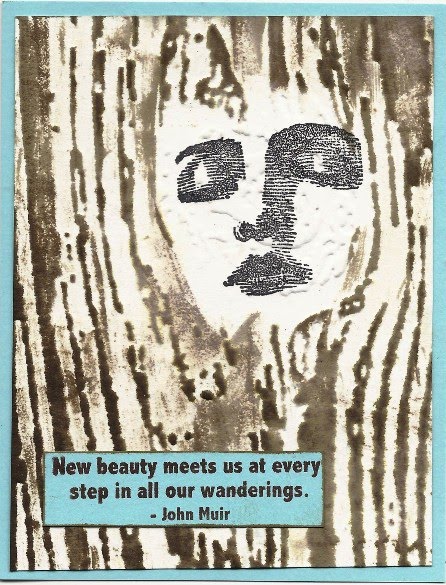
Bloggers Challenge 162

This week the Bloggers Challenge is Black/White and color of our choice. I think the color splash challenges are a lot of fun. For my color choice I chose yellow. I used a Thomas Kinkade stamp. Since he is known as the painter of light, it seemed obvious that I should use yellow and highlight the windows. I stamped my image on stampboard. I love to use stampboard for black and white stamping. My windows are highlighted with Creative Inspirations sunshine yellow paint. Not only does the paint contrast with the black and white, it shimmers like light from a window might do. I used the torn frame technique around my image and carried the colors to the embellishments on the card.
I can't wait to see what the other members create.

Thursday, July 29, 2010

Jungle Time

This week Team B of the Creative Inspirations Design Team had the challenge of The Jungle and of using grungeboard or chip board on our work. Okay, I had a little too much fun. I couldn't decide whether to use the King of the Jungle or my jungle party animals. So instead of making a decision, I did both.
The King Lion is a stamp from Auntie Amy. I stamped and embossed him and then painted him with CI paints. The grungeboard embellishments (ROAR and the crown) are also painted with the paints. It's too bad that scans don't show the true shimmer of the finished card.
My second card features the Safari party animals from Lost Coast Design. This set of stamps makes me laugh each time I look at them. Each of the animals is painted with Creative Inspiration paints. To make the party hats I restamped them on grungeboard, cut them out, and painted them. Creative inspiration paints works so well with grungeboard. "Par*Tay" is stamped on a painted piece of grungeboard. The balloons are outline stickers with painted with the paints. Hope they make you smile too.
If you create something with Creative Inspirations paint, please share with us on the Creative Inspirations BLOG.

Wednesday, July 28, 2010

Oh Alice Challenge Chapter 23

This week's challenge in Oh Alice is birds, and where in Alice do you see more birds than in the Caucus Race. I chose my image from Rubber Stamp Avenue. The background of the image is pulled glimmers, from the current Technique Junkies newsletter. The images are colored with Copics.

Critter Sketch Challenge 24 and Try That Technique Metallic Explosion

This week I was able to combine the Critter Sketch challenge which was a sketch challenge with the Try That Technique technique challenge. The technique challenge was Metallic Explosion from the August 2006 newsletter. The background was done using the Metallic Explosion technique on black matte cardstock. I used silver and copper metallics alcohol ink with plum and lettuce. When I did the technique, it reminded me of a sea fan, so I headed to my sea stamps. The two fish are from Fred Mullett. The sea horse, sea shell, and words are from Oxford Impressions. The ribbon with the sea shells was from my stash. I used my Creative Impressions paints to add the silver metallic color to the shells. I also use the paints to edge the image panels. The shimmer of the paints added to the metallic shimmer of the technique.

Tuesday, July 27, 2010

Cinema Saturday Creative Challenge 89

This week the Cinema Saturday challenge movie is Casino Royale and the extra challenge is to use a silhouette. Well, when I think of James Bond movies I think bling and elegance and romance, as well as intrigue and espionage. In Casino Royale there is the addition of the gambling. I tried to feature as many of these themes in my card as was doable.
The background is triple embossed. First layer are the dice with the dots highlighted with onyx Creative Inspiration paint. The second embossing were the romantic words. Again I used my Creative Inspirations gold paint to highlight "Romance". The third embossing was the chandelier which is highlighted in antique gold. The roulette wheel is an image from Print Shop which I used a transfer technique on. The stamped silhouette images is from Onyx Expressions. The bling is from my stash.

Monday, July 26, 2010

Play Date Cafe Challenge 39

The challenge at the Play Date Cafe is twofold -- both a color challenge and an inspiration challenge. I love working with the combination of neutral colors. I used an image from Bella Rosa stamps which I thought expressed a similar feeling to the given image. I stamped it in expresso on kraft colored paper and used white gel pen for the highlights. I tore around the image and bordered it using the torn frame technique from Technique Junkies. The background paper is from Tim Holtz's paper stacks. The sentiment is from Club Scrap.

Just for Fun Challenge #21

This week's Just for Fun challenge is to use the colors blue, gray, and yellow. The background is a piece of design paper I had in my stash. I thought it was so pretty and perfect for the challenge. The bird die is from Tim Holtz Alterations Caged Bird dies. The bird was cut from a piece of Shimmer Sheetz and dry embossed using an embossing folder.

Sunday, July 25, 2010

Critter Sketch Challenge 23

This weeks Critter Sketch challenge is twofold -- Christmas in July and use a given sketch. I chose a stamp from the Artistic Outpost stamp sheet Snowy Woods.  The image was colored using pan pastels. The background was dry embossed using one of the Tim Holtz texture fade embossing folders, Bricked. I also used pan pastels to highlight the texture. The holly and the Merry Christmas are outline stickers which I rubbed black pastels over to distress them a little.

Created By Hand Challenge 07-19-2010

This week the challenge at Created Byhand is "Looking in...Looking Out/Use Dies". The background of my card was cut using a Tim Holtz Alterations die Baroque and grungepaper. Instead of the actual die cut, I used the reverse as a frame. To color the frame I used my pan pastels. The result is a frame that looks and feels like suede. WOW!  I also used a reverse die cut as a template for the blue geometric behind the butterfly image. The butterfly and hydrangeas are stamped using Kitchen Sink Stamps.
Color recipes: All inks used are Adirondack dye inks.
Butterfly -- 1 sunshine yellow, 2 sunset orange, 3 expresso
Flowers (stamped out of order) -- 3 purple twilight, 2 cool peri, 1 shell pink and then restamped with cool peri, 4 currant.
Leaves -- 1 willow, 2 citrus, 3 lettuce

Color Throwdown Challenge 102

This week at Color Throw Down the challenge was to use the colors marina mist, wild wasabi, and not quite navy. Of course these colors brought to mind a sea theme and what better representative of the sea than a mermaid. This adorable mermaid is from Paper Jewels and the saying is from Club Scrap. My little mermaid is painted with Creative Inspirations paints -- sapphire, turquoise, and evergreen -- to match the challenge colors. I love how the paints shimmer, rather appropriate for a mermaid I think.

Friday, July 23, 2010

Oh Alice Challenge Chapter 22

This  week the challenge at Oh Alice is to create a piece of art using sea life. I started by using a digital image from Alice ATC from Moonlight Journey for the background. Then I took a piece of acetate and stamped the fish (Fred Mullett) and shells (Stampin' Up) and word with Stazon on the printable side. On the reverse I used my Creative Inspirations paint to color the fish and shells. They have such a beautiful shimmer through the acetate.

Bloggers Challenge 161

This week blog mom Lisa challenged us to use something recycled. One of my favorite things to recycle in my art is a diet Coke can. They make wonderful metal panels and are easy to work with. I cut down the side and then work around to remove the top and bottom. I run the remaining rectangle panel once through the wizard to flatten it and it becomes a workable panel. [OK, use a little care so you don't cut yourself.] On the metal panel I used the Faux Etched Copper technique from the current Technique Junkies newsletter and my gears embossing folder.  For the second panel, I used stamps from the Artistic Outpost  set Steampunk to create a collage. The Steampunk theme went so well with the metallic gears panel. I painted the entire collage with Antique Silver paint from Creative Inspirations. I thought it fit right in with the Steampunk images. It gives the images a real shimmery metallic look. The embellishments are from my recycled junk bin in the basement. And believe me, searching through that bin shows my true dedication to my art.
I can't wait to see what everyone else has created.

Thursday, July 22, 2010

Compendium of Curiosities Challenge 6--Multi-Medium Collage

This week's Compendium of Curiosities challenge was taken from page 66 of Tim Holtz's book. It's Tim's Multi-Medium Collage technique. All of the stamps, including the stitches and the sentiment, are from Tim's collection. The background paper is from the paper stack Vintage Shabby and is stamped with various Tim Holtz stamps using Adirondack dye inks. The die cut grungepaper is cut with Tim's alteration dies, Tattered Florals and Styled Labels and edged with distress inks. The key is one of Tim's word keys. I wasn't sure what direction this piece was heading in, but I like where it ended up.

Cinema Saturday Creative Challenge 88

This week Cinema Saturday challenge is featuring the movie Best in Show. The challenge is to represent the movie and also to include an accordian medallion on the card somewhere. Since the movie is about a dog trainer and a dog (I do the movie no justice here) I used my two new puppies on my card with the sun smiling down on them.
A few notes about the images and coloring techniques. The dogs are from Cornish Heritage Stamps. The doghouse is a morphed version of a stamp from Too Much Fun Rubber stamps. The sun's face is from Kitchen Sink Stamps. Most of the coloring was done with Creative Inspirations paint. The doghouse is stamped on wood paper and then painted with the paints. The dogs were topcoated with the paints to even out their coats. The collars were done with Smooch. This was my excuse to finally try Smooch after having them in my drawer for months. The sky was done with Creative Inspirations applied with a sea sponge. Someday when I'm not working in my studio, I'll have to catch up on all these cool movies.

Monday, July 19, 2010

Just for Fun Challenge #20


This week the color challenge for Just for Fun was to use orange, brown, and yellow in our art. I chose to use stamps from the Artistic Outpost sheet Country Life. I used the Double Duty Melted Wax technique from the current Technique Junkies newsletter.

Sunday, July 18, 2010

Try That Technique -- Top Latch Card


This week's Try That Technique challenge is the Top Latch card from the June 2008 Technique Junkies newsletter on-line technique. It was a fairly simple technique once I followed the directions. I had the wrong impression of what the latch strip did. In short, it latches the card shut.
All of the stamps I used are from the Artistic Outpost sheet Keeper. For the main image I used Creative Inspirations paints to color it. They give such a beautiful finishing shimmer to the image.

Created By Hand Challenge 07-13-2010


The theme challenge this week at Created ByHand is “Freedom…Stars” and this is the card I created. I just received a set of stamps from Club Scrap and this sentiment was one of the stamps. When I saw it, I immediately thought Freedom of Speech and the card was begun. The stars and swirls stamps,from Kitchen Sink Stamps, are stamped in pearl beige brilliance ink. The sentiment is stamped on wood paper.

Saturday, July 17, 2010

Critter Sketch Challenge 22

This week the Critter Sketch Challenge is a inspiration challenge. After just celebrating July 4th,

we are now going to celebrate what we are thankful for. So this week our card or project should have the theme of THANK YOU!
The paper, the sentiment and the flower brad all come from Club Scrap. The top frame was die cut and embossed using one of the new Cuttlebug cut and emboss folders. I love the sentiment, but because the flower is dimensional, the words didn't scan clearly. The sentiment says "I would Thank you from the bottom of my Heart, but for you, my heart has no bottom."

Friday, July 16, 2010

Cinema Saturday Creative Challenge 87

This week's movie challenge at Cinema Saturday was The Holiday and to use eyelets on the card. [The short and long of it all~ Two girls who have men trouble.... Swap homes at Christmas time. One in the US and the other in England. They each meet local guy to fall in love with.] My card uses double embossed metal technique from Technique Junkies. I used red metal and embossed it first with the Christmas wreath. I sanded the raised part and then reflattened the metal. Next I embossed with the romance folder and highlighted with black Stazon. I thought the card represented the movie pretty well.

Bloggers Challenge 160

This week's Bloggers Challenge is a sketch. I really like this layout and I had a lot of fun with it. The stamp I used for the focal image from Stampington is one I have always liked. She is stamped with Versamark and embossed to get the sharp contrast of black on white. The middle panel is a piece of cardstock from Club Scrap. The background panel was made by spraying starfish glimmer mist over a stencil and then spraying the whole piece with pearl. The sentiment is from the Club Scrap Asian font.

Thursday, July 15, 2010

Color Throwdown Challenge 101

Color Throwdown is now into its 101st challenge. Last week was so very exciting. This week the challenge is to use the colors kiwi kiss, black, kraft, and baja breeze. I found this piece of DP in my stash which definitely said kiwi kiss and baja breeze. That left me free to play around with one of my favorite Artistic Outpost stamp sheets,  Fortune Teller. I stamped the fortune teller and the crystal ball in black ink on kraft cardstock. Her jewelry is highlighted with crystal and white gel pens. The crystal ball is covered with glossy accents to give a glass-like appearance

Just for Fun Challenge #19

This week's Just for Fun challenge is to use the colors light blue, brown, and cream in our art. I must thank my friend Jan for the basic idea for this card...we had a conversation a while back about using a face with this texture fade embossing folder. This color challenge gave me the opportunity to try out the idea. First I stamped my face (Stampland) where the knot hole would be. Then I embossed the cream cardstock with the woodgrain embossing folder. I highlighted the woodgrain with faded corduroy and walnut stain distress inks direct to paper.The sentiment is from Stampscapes.

Eat Dessert First

Have you ever heard the saying "Life is short, eat dessert first."? I think that's what these cupcakes are saying. The Creative Inspirations Design Team B had the fun of creating art featuring desserts. The cupcakes were stamped with a stamp from Club Scrap, masked and stamped twice more. the sentiment is also a Club Scrap stamp. To color the cupcakes I used blush, spring green, and tanzanite paints for the papers, chocolate for the frosting, caramel for the cake. The cherries are candy cane Stickles. the background was stencilled using a sea sponge, a Glimmer screen stencil, and mellow yellow paint. Stencilling with a sponge works really great. This card is truly shimmery, although the scanning doesn't show the full shimmer.

Play Date Cafe Challenge 38


This week at the Play Date Cafe, Artistic Outpost is sponsoring Challenge #38, using lime green, with dark and light purples (see inspiration photo).  I chose to use stamps from the Artistic Outpost sheets Bloom and Grow and Country Life. I just love these two sets and they go so well together. To create this card I started with the seed packet. I masked off the center of the stamp and inked the border with Versafine imperial purple ink. I then taped off the border and inked the center with Adirondack lettuce ink. Using the stamp positioner I stamped the center of the seed packet. I then stamped the little girl with the wheelbarrow and a second head of lettuce. I used Creative Inspirations paint to color the lettuces and the girl. I cut out the girl and wheelbarrow and the seed packet. I cut out the inner part of the lettuce and attached it to the wheelbarrow. The words were stamped in purple, cut out and highlighted in lilac. The background was embossed using a Cuttlebug embossing folder and highlighted with Brilliance ink. The cut elements were attached to the background and the layer was attached to a white card base.
   Come and play along at the Play Date Cafe, enter your card using these 3 colors for a chance to win a $14.00 Gift Certificate from Artistic Outpost. You can use any stamps to play............ However....if you play using Artistic Outpost stamps, don't forget to enter it in the monthly contest on the Artistic Outpost Blog (July Referral program) for a chance to win a $14 Artistic Outpost Gift Certificate! It's a chance to win twice!

Wednesday, July 14, 2010

Oh Alice Challenge Chapter 21

This week's Oh Alice challenge is an un-sketch. We were given a sketch, but we were to make some changes in it somehow. There are no rules except to break them, meaning we couldn't follow the sketch exactly! As you see, I have provided two pictures of my challenge. Actually it is only one card. I just flipped it upside down for the second image. My sketch breaker is to create a card which is the same right side up as it is upside down except for the background colors which reverse. For my image I used the Queen of Hearts cuttlebug folder. This was a crazy kind of card--one that you might expect to find in an Oh alice challenge.

Tuesday, July 13, 2010

Compendium of Curiosities Challenge 5--Distress Powder

I won't be late for this week's Compendium of Curiosities challenge. The challenge is Distress Powder from p. 43 of Tim Holtz's book. I started my art with paper from my paper stack (Tim Holtz) Lost and Found. I distressed the cardstock using my Distrezz-It All and them used pumice stone and vintage photo distress inks along the edges.all of the stamps except the birdcage (Stampington) are from the Tim Holtz collection. I used the distress powder on the birdcage and the flowers. I think it gives the images such a cool effect.

Technique by Design for June/July 2010

With two days to spare I finished my Technique by Design artwork. The challenge is to use this sketch and use at least one technique from the current Technique Junkies newsletter. I followed the sketch to the last 1/8 inch. Finding techniques for the panels was fun and actually doing them was even more fun since I tried new techniques (to me) for the two big panels. Panel A used the Faux Etched Copper technique. For my alcohol inks I used the same colors as I used in Panel B. However, the effect on copper gives them a different look. Panel B uses  the Background Whimsy-Dye Method technique. The stamp used is from Cornish Heritage Farms and the dye inks are Adirondack pool, mountain rose, and citrus. The center panel C uses the Wisped frames technique. The stamp is from the Artistic Outpost sheet A Lovely Day. The sentiment is from Club Scrap Blossoms. For my embellishment I couldn't resist using a butterfly which I picked up at the Tinley Park Stamp show this past weekend.

Monday, July 12, 2010

Compendium of Curiosities Challenge 4 Shabby Chic

I'm a day late with posting this challenge. A new Compendium of Curiosities challenge has already been posted. However, I am determined to do all of the challenges, so here is my version of Shabby Chic, Challenge # 4. The focal stamp is from the Tim Holtz collection as is the die. The die cut was cut from grungepaper. The background is a dictionary page using a version of the peeled paper technique from Technique Junkies and then sprayed with Glimmer Mist and stamped multiple times with a star from Stampland.

Try That Technique -- Polished Mulberry

This week the Try That Technique from the Design Junkies blog is polished Mulberry from the June 2003 newsletter. I had to morph the technique a little and use the mulberry paper as the background over the glossy paper since I couldn't get the image to appear clearly on the glossy. It still makes for a lovely background. The background colors are Adirondack raspberry and pool dye reinkers. All stamps are from the Artistic Outpost sheet Lovely Day.

Saturday, July 10, 2010

Play Date Cafe Challenge 37

The theme this week in Play Date Cafe was 'Provencal-Style'. Our art is to be based on the colors shown in the challenge picture. I tried to combine the theme and colors in my image. I thought this French market scene (OnyxXpressions/Sunday International) depicted the feel of Provence and I tried to use the colors. My tans and beiges are a little darker than the theme image, but are in the same family. Like the pottery, color is added as highlights. I used Creative Inspirations paint to highlight elements in my image. Around the stamped image I used the Technique Junkies torn frame technique. The blue background paper is from the Tim Holtz paper stack Vintage Shabby. Hopefully, the viewer can feel the Provencal-Style from my work.